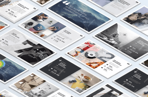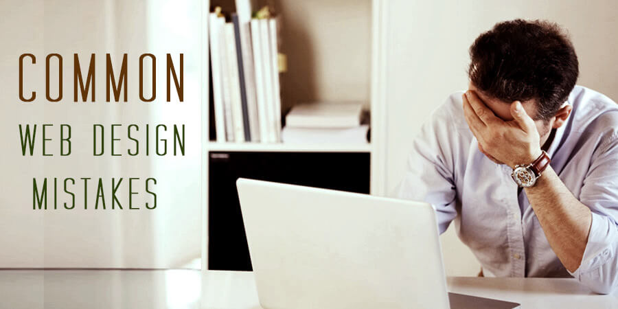
Building a website can be easy but the real challenge is, making it usable. Before start building a new website (or redesign current site), check following some of most common web design mistakes, as well as some friendly suggestions for create a great user experience and grow your bottom line.
Non responsive website
As per current responsive web design trends, if your site has horizontal scrolling it’s an inglorious. A good website fit on most screen sizes such as smart phones and tablets. Ignoring these devices will harm your business, because Day by Day more and more website visits come from mobile phones and tablets and this trend is accelerating.
To know more about Why Responsive Website Web Site is very important CLICK HRER.
Complicated Navigation
Navigation is one of the most important parts of the website. It’s advisable that place your navigation bar where the visitor will see first it like on the top. Try to cover all the possible links because the main purpose of the navigation is to act like a map, so it’s necessary that your site visitor to be able to find everything they need. Remember, navigation should easily identify and understand for visitors because they are not visit your site to play treasure hunt games, if they can’t find what they want in less than 3 clicks, they will leave immediately. Avoid missing links, entertaining and blinking links. Organize and structure your navigation in tandem with the theme of the website.
Unreadable Content
Have you ever seen a website that has white text on a red or blue vibrant background or light grey text on white background? It may look nice from a design point of view, but its hurt user’s eyes. Before start create style sheet compare color schemes, font size & style of most major sites and improve your site colors for more readability. A good readable design will grab the user’s attention to read your text.
Auto-Play Sound
The ability to embed audio and video on a website is one of the greatest advantages of a website but never set it auto play on site load or never put background music if you haven’t any strong reason. It is possible that your site visitors may be at work, in a library or somewhere else and if auto play sound start user away from your website as quickly as possible!
Where’s the Search box?
Your web is like a house of information. Whatever it’s a corporate website or a blog, big site or small five page site, a search box is must essential. The visitors are visit your site to get some information and it is possible information which visitor needs is on another page. So, with the help of search box visitors will get what they want, otherwise nobody have time to open you site pages one by one and get the information.
Splash page
First of all a splash page and a landing page both are different so don’t confuse between them. Splash pages were used to advertise or an introductory page of your Web site. Users don’t like splash pages, if your splash page design is very creative or attractive, even though as per some studies 25% of visitors left a site right after seeing a splash page.